by Brock Horning | February 2025
Successful data storytelling can be transformative for your interactive project. Data is only useful if you can understand its implications and glean actionable insights from it. By turning the raw data behind your audience’s choices and journey into an easy-to-understand narrative, you’ll know how to take your interactive project to the next level.
What is data storytelling for interactive projects?
Data storytelling is the process of turning raw data and statistics into an interesting and easy-to-understand narrative. It uses core storytelling techniques to transform a series of numbers into an engaging story that helps creators and companies improve their interactive projects.
Data is only valuable if you can use it to inform decision-making. By connecting data into a series of connected events, a narrative emerges that can tell you what is working and what isn’t. It’s also a handy way to communicate results and data with other stakeholders.

Where will your data story take you? Image generated by Firefly AI.
Why is data storytelling important for interactive projects?
Data storytelling is the first step to improving your audience’s experience and getting stronger results from your project. If you fully understand what the data is saying, you’ll be able to analyze where your interactive project is working, where needs improvement – and most importantly – how.
😃 Simplifies the complex – takes the chaos of raw data and turns it into an easy-to-understand series of events and consequences with clear actions.
👏 Understand your audience – how your audience moves through your interactive experience can tell you a lot about them. Data storytelling highlights audience behavior and identifies friction points along the way.
👋 Engages the audience – if you need to communicate your data insights to your wider team or external stakeholders, data storytelling makes it easier for people to remember and understand your analysis.
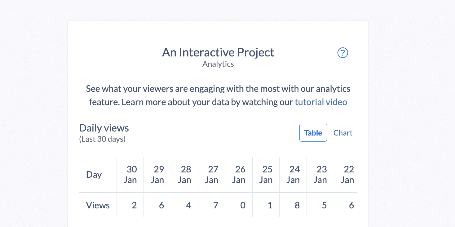
A snapshot of information from Stornaway Analytics
Key elements of effective data storytelling
Data
There is, of course, no data storytelling without data itself.
A data analysis is the first and potentially the most time-consuming step. With all the data available to creators, part of the challenge is working out what to focus your attention on. Which information is most relevant?
To help your data analysis, it’s useful to have a clear goal in mind. For example, measuring brand recall will consider different metrics to measuring product sales but these can still be part of the same interactive experience.
Having this goal from the very outset will help form the foundation of your narrative.
Narrative
This is where those storytelling techniques come into play. Establish the fundamental elements of any story:
🤔 The problem – It’s important to define what you are trying to achieve from the outset. Is it to understand why the audience isn’t getting to the end of your interactive film? Or, is it how to increase pass rates in your training module?
📓 The context – lay out the current state of affairs, relevant to the problem. If your audience isn’t getting to the end of your interactive project, where are they dropping out? If pass rates are down in a training module, take a deep dive into which quiz questions are regularly wrong. Build in any relevant wider factors that may have influenced the problem.
🗺️ The way forward – Considering the context, what actions can be taken to resolve the problem? Show the potential to improve the issue. Sometimes, it can be helpful to lay out a step-by-step, linking each step with a data point.
📍 The goal – where would you like to be? Sometimes having tangible targets or metric-based goals can help focus minds on successful solutions.
Visualizations
They say a picture tells a thousand words. Data visualizations are the final element to boost engagement in your data story. A well-chosen visual can explain a set of data insights in a way words simply can’t.
Consider which type of visualization best demonstrates the insights and story, and who your audience is. However, whatever your narrative, these three tips will always apply:
🤓 Clarity – eye-catching visuals can boost engagement but must not get in the way of readability
🗓️ Consistency – a narrative is a connected series of events, consistent visuals help audiences link different data sets together
🪄 Interactivity – as we always say in interactive projects, you can boost engagement by letting the audience explore the data for themselves
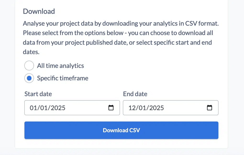
A snapshot of information from Stornaway Analytics
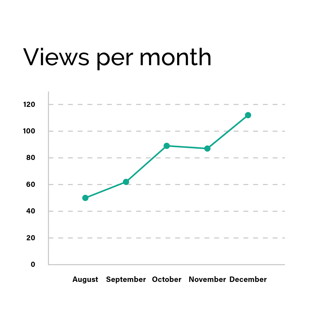
When to use data storytelling
To review project success
Your interactive project is running and you want to measure it’s success. It’s easy to focus on easy-to-grab stats like view count or website clicks but that never tells you the whole story. Data storytelling can reveal the success of less tangible project goals such as attitudinal change or brand recall.
To persuade a stakeholder
A data story can be designed to engage and persuade. If your interactive project is a pitch for investment or a product demo, you’ll be able to see how engaged your audience is and which elements of your presentation is holding their attention.
To resolve an issue or anomaly
You’ve come across an unexpected issue. Maybe most viewers aren’t reaching the end of the interactive experience. Maybe people aren’t finding the information they need within your interactive video. Identifying the friction points in your audience journey will show where your interactive video needs to change.
To uncover opportunity
We can say from experience that interactive projects benefit from a process of continual improvement. Whatever the aims of your project, the data will be able to reveal opportunities to make it even better. In essence, this is about spotting patterns, trends, or anomalies in the data and seeing how viewers move through the interactive experience.
Here are a few examples:
Product demos
Which product features have the highest view count? Which have the fewest? This can reveal which features hold the most appeal for prospective customers.
Rebel’s Playground created an interactive conversation with Barriesta Phumlani at Manaka Coffee to walk you through their products and choose the right coffee for you ☕️
Interactive tours
How do your viewers move through the virtual space – and what does that say about their intentions and motivations for taking the tour?
Visit the World’s museums in 360 from the comfort of your home.
Video websites
Which products or services are website visitors looking at most? This can reveal much about which areas of your brand appeal most to prospects.
Visit Nina’s Garden website to see this interactive website in action. Bear House Media gave combined interviews, 360 videos and plans ready to explore.
Branching scenario training
If learners are regularly making same mistakes, which elements of the learning material need to be updated?
Use Stornaway with AI-generated videos to easily create scenario training modules.
How Stornaway Anaytics can help
Here’s a little something that makes Stornaway unique. Our analytics dashboard has a wealth of data to help creators improve their interactive projects.

A snapshot from Stornaway Analytics

A modular design
Stornaway uses a flowchart-style system to make interactive video creation clear and straightforward. Each piece of media has its own Story Island that can be linked to any other island.
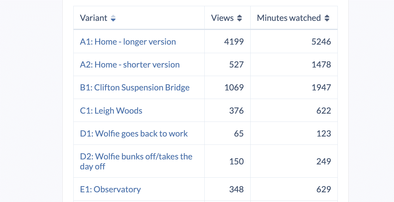
As every Story Island is individual (and even has its own public URL), there are clear trackable moments that reveal much about your audience. Creators can see everything from a specific Story Island view count to individual answers for specific quiz questions.
Core Analytics
On our Pro plan, creators can see how many views each story island has received and how many minutes viewers have spent on it. This will show where your audience are spending their time and what is engaging them.
Advanced Analytics
Our Custom plan creators can take it to the next level with the Stornaway API. This opens up a wealth of data with the ability to see how individual viewers moved through your interactive project, what they clicked and where they dropped out.
This powerful level of data means Stornaway can record each answer from an e-learning quiz and feed this into your chosen LMS. It can reveal how audiences are moving through your interactive experience and the most common point thet dropped out.
Essentially, it can tell the data story behind your project.


